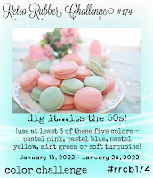
I was asked by Retro Rubber Challenge Blog to be a guest designer on their blog this month. It was a color challenge, all pastels. If you know me that was a bit of a challenge as I do love earthy colors.
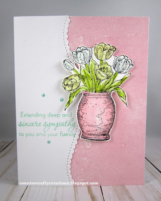
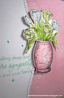
I don't normally use bright colors for a sympathy card but I was in need of one and was going to use flowers on it so I went with using it for this challenge. My stamp is from 2009 and I colored with my Spectrum Noir markers. Hard to see but the lightest flowers are a light blue, and the others are yellows, I had to add a bit darker green so that I could tell the leaves from my flowers.
- Northwoods Rubber stamps - Mini Tulip in Clay Pot, 2009
- PPD - Stitched Mini Scallop Border die
- Taylored Expressions - Care & Comfort II stamp sentiment
- Liquid Pearls - Mint Green
- Paper from stash
It is fun to get out our old stamps and play with them, I hope you do and join in the challenge this month!
Thanks for stopping by,
Connie
16 comments:
This is lovely Connie and I don't think the colors are too bright for a sympathy card. It's a beautiful and peaceful card filled with heartfelt love. Congrats on your guest design team spot!
So cute.
I love that pretty stamp! Beautiful sympathy card. The white border is lovely too.
A very nice sympathy card. You really worked outside the box for you. It sure stretches us doesn't it?!
what a beautiful card, you used the pastel colors wisely!! nice for you to be a guest designer!!
lovely card!
A lovely card and gorgeous design, very pretty..xx
Congrats on your Guest Designer Gig! I love this card, the design is lovely, as are you soft tones! That image is sweet too!
Congrats on the GDT spot, Connie. The card is beautiful xoxo
WOW! Congrats on the Guest Spot and you have certainly met the challenge! This is GORGEOUS! Beautiful overall design ... I simply love it Connie! Great job!
I don't think the lovely colours in this sympathy card are too bright at all. The pastel colours are perfect for a sympathy card, as are the lovely details.
Congratulations on your GD spot, Connie! I think this is one of the best challenges because it gets us to look into our older stash of stamps. This is a pretty card with the tulip vase and you did great with these colors. It can be nice to receive a sympathy card with pretty colors like this.
Great layout for your sympathy card and that pot of flowers is perfect in the pastels.
This is so pretty and absolutely perfect for a sympathy card.
Connie...this is such a delightful card and it shows off our colors well! Thank you for being our guest designer for this challenge!
This is beautiful, Connie! No one would know that pastels are a challenge! Lovely spring image! Thanks for being our GD this go-round at Retro Rubber!
Post a Comment